10A. Media Queries
Overview
We have already talked a bit about Media Queries, but here is the information in one place.
What are Media Queries?
Media Queries can be kind of seen like a CSS specific if statement, for example the following media query:
@media (orientation: landscape) { .winTitle { display: none; }}
This will say that if the media is orientated in landscape mode then the object with the class winTitle will not be displayed.
This is only a rudimentary explanation, if you want more of a deep dive then please read through this link:
Using Media Queries
How do i implement them into CSS?
Like we saw above @media will tell CSS to listen to the device it is currently displayed on, the statement in the () brackets will be the condition, and the code in the
{} brackets will be run if the statement is true.
You can use the code in your CSS like in the example shown above, we recommend using the Media Queries First and then after the Media Queries put the normal CSS code that should be run anyways, no matter what, this just makes the file a bit more readable and maintainable for yourself and others that will work on them.
You can also take a look through the code of the MediaQueries.bbj to see how we implemented them and how they effect your webpage on different sizes,
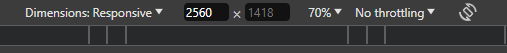
just start the programm and press Ctrl + Shift + M to see the Toggle Device mod, you'll mainly use this for responsible Design, at the top you can input your screen sizes,
put in a width value of less than 600px and see what happens.
What are the standard Screen Sizes to use?
You may ask yourself what the Screen sizes you should use and when to use:
@media (min-width: width) {...}
or
@media (max-width: width) {...}
Min-width means that it only applies if the width is at least the given amount, max-width only applies if it is less than the given amount.
W3Schools is also a good Resource to look for Responsive Design and they have the Typical Device Breakpoints listed, but don't worry, we have a small MediaQueryExample.css which has all of these and a few commented lines to help you find around and give you a small Jumpstart when you make a new CSS file.
Here is a quick list of the typical device Breakpoints:
- Phones: (max-width: 600px)
- Small Devices: (min-width: 600px)
- Tablets: (min-width: 768px)
- Laptops: (min-width: 992px)
- Desktops: (min-width: 1200px)
Note: You can use whatever Breakpoints you deem fit for your app, these are just typically used.