2C. CSS Styles and CSS Custom Properties
Overview
This section covers inspecting, modifying, adding, and deleting CSS styles on BBjControls. It also covers the DWC's CSS custom properties and how to access them to style your app.Concepts Covered in This Section
- The DWC's CSS custom properties
- The DWC's App Themes
- Modifying a BBjControl's Style Properties
- Using Directives to Inject JavaScript and CSS Dynamically
- The Web Component Architecture and the Shadow DOM
- Font Size Compatibility
The DWC's CSS Custom Properties
In the previous section, we got our first look at the DWC's CSS custom properties, also known as CSS variables because they are dynamic in the sense that their value may vary just like a BBj variable's value can change over time. CSS custom properties are entities defined by CSS authors that contain values that are often reused throughout a web page or DWC app. They are set using custom property notation that must start with two dashes, e.g.
--dwc-color-black: #000;
and their values are accessed using the var() function, e.g.
color: var(--dwc-color-black);
Given the above examples, "--dwc-color-black" is the CSS custom property and its value was set to the color black, or "#000" in shortened hex notation. Note that the variables start with two dashes, are all lowercase, and use single dashes to separate words in the property name.
CSS custom properties are particularly useful in complex pages/apps that frequently reuse the same values (or colors in this example). It's not uncommon for CSS authors to reuse the same colors dozens of times, and before CSS custom properties were available developers were required to perform a tedious global search and replacement whenever the color needed to be changed. With CSS variables, you only need to change the definition of the color (the color's value) once and the change is propagated throughout the page or app. Therefore, CSS custom properties allow us to store a value in one place and then reference that variable all throughout the rest of the CSS.
CSS custom properties also support fallback values, as in:
color: var(--dwc-button-color, red);
In this example, the color of the text on a BBjButton is set to the value of the --dwc-button-color CSS custom property, or the color red if that custom property is undefined. The DWC-specific documentation for the BBjButton has a CSS Properties table that lists all the CSS custom properties specific to the BBjButton.
The CSS Tricks A Complete Guide to CSS Custom Properties page is a fantastic resource to learn all about CSS custom properties and covers all sorts of aspects including using properties as properties, splitting up colors into their components, cascading, and more.
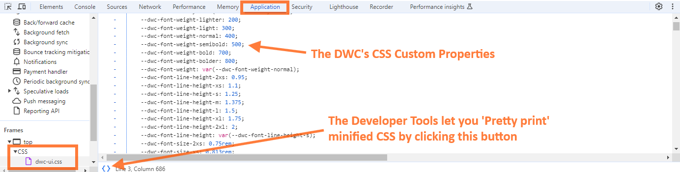
You can get a feel for all the DWC's CSS custom properties by switching to the Application tab in the Developer Tools, then viewing the contents of "dwc-ui.css" file. Even if the CSS file has been minified, the Developer Tools give you the ability to easily toggle between the minified state of the CSS and a pretty printed (or formatted) version.
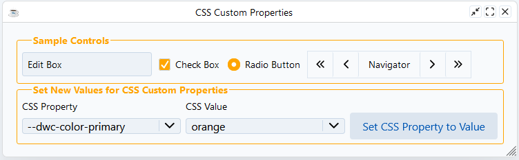
Example 1 - Setting Custom Values for the DWC's CSS Custom Properties
1) Load the CSSCustomProperties.bbj program from the 02_CSSStylesAndCustomProperties folder into Eclipse and launch it as a BUI program using the toolbar button. It will automatically relaunch itself in the DWC, so you don't need to change the URL in the browser. Experiment by choosing different CSS custom properties (or typing in your own) from the bottom left BBjListEdit, choosing or typing in a custom value from the bottom middle BBjListEdit, then pressing the bottom right BBjButton to make the change. The following screenshot shows the result of changing the "--dwc-primary-color" CSS custom property to the value "orange". Note that the background color of the check box and radio button has changed to orange.
This program used the following line of code to make the change:
sampleWindow!.setStyle(currentProperty$, currentValue$)We simply get the currently selected Property and Value from the respective BBjListEdit buttons and put their Text as the variables needed to call a .setStyle() method.
2) The previous CSSCustomProperties.bbj program styled the BBjChildWindows using the .injectStyle() method for initial Styling and the .setStyle() method for changing the style via BBjListEdit buttons, both for layout as well as appearance. In particular, notice how the code uses two JsonObjects: json! that is applied to the child window and title! which is applied to the child window's legend component of the fieldset. In particular, the second line of the code is what applies the Properties to the legend, the legend is the title component of the window's underlying fieldset element:
Going the Extra Mile
    newValue!.addClass("fieldSet")
    css! = css! + "fieldSet legend {"
    css! = css! + "   color: var(--dwc-color-primary);"
    css! = css! + "   font-wieght: bold;"
    css! = css! + "}"
1) Try adding another property to the css! object above to modify the window's title. For example, try adding the "text-align" CSS property with the "center" value. How does that change the appearance of the child windows?
The DWC's App Themes
The DWC offers three different built-in app themes: light, dark, and dark-pure. It's pretty easy to change the theme in a DWC app, as shown in the following code:
    rem Get the WebManager to apply the themes
    web! = BBjAPI().getWebManager()

    rem Set the DWC dark theme
    web!.setDarkTheme("dark")

    rem Set the DWC light theme
    web!.setLightTheme("light")

    rem use .setTheme to automatically use the system preferences and applies the above mentioned associated theme
    web!.setTheme("system")
web! = BBjAPI().getWebManager()When the client's OS is in light mode, the app will display using the DWC's light theme. If the user changes their OS to the dark theme, then the app will use the DWC's dark-pure theme. The Themes.bbj program is similar but sets the app to always display using the DWC's dark theme. Finally, the DWCThemer.bbj program is also similar to the DWC2.bbj program but applies a CSS theme created by the DWC Themer utility.
web!.setTheme("system")
Example 2 - Setting a DWC App to Dark Mode
1) For this exercise, add one of the lines of code above to the CSSCustomProperties.bbj program and then run it again to see what it looks like in dark mode. If you use the line that sets it to the dark mode, that's all you have to do to see a difference. But if you used the last line that follows your operating system's mode, then you'll have to change your OS mode in order to see the DWC app change. After making the change, the program should look similar to the following: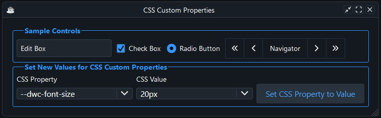
Modifying a BBjControl's style properties
So far we've covered multiple ways of setting styles on a BBjControl, including directly in the browser's Developer Tools. But there are actually several ways to accomplish this task, such as straight CSS, CSS custom properties, and even styling the inner elements of the control's shadow DOM elements. The SetStyle.bbj program in the 02_CSSStylesAndCustomProperties folder demonstrates several of these options:rem Set the button's style via setStyle() and CSS
myButton1!.setStyle("background", "purple")
myButton1!.setStyle("color", "yellow")
rem Set the button's style via the @element directive and standard CSS
rem Note that this does not produce the 'expected' results - why?
myButton2Css! = ".myButton2 {"
myButton2Css! = myButton2Css! + " background: purple;"
myButton2Css! = myButton2Css! + " color: yellow;"
myButton2Css! = myButton2Css! + "}"
myButton2.addClass("myButton2")
web!.injectStyle(myButton2Css!)
rem Set the button's style via modifying CSS custom properties
rem Note that this doesnt change the hover behaviour
myButton3Css! = ".myButton3 {"
myButton3Css! = myButton3Css! + " --dwc-button-background: purple;
myButton3Css! = myButton3Css! + " --dwc-button-color: yellow;
myButton3Css! = myButton3Css! + "}"
myButton3.addClass("myButton3")
web!.injectStyle(myButton3Css!)
rem Set the button's style via the shadow DOM parts
myButton4Css! = + ".myButton4::part(control) {"
myButton4Css! = myButton4Css! + " background: purple;"
myButton4Css! = myButton4Css! + " color: yellow;"
myButton4Css! = myButton4Css! + "}"
myButton4!.addClass("myButton4")
web!.injectStyle(myButton4Css!)
The code for myButton1! and myButton2! both attempt to set the foreground and background color of the button, but only the code for myButton1! works as expected, as shown below:
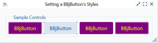
If you look closely, you can see that the corners of the second button are actually purple, but the purple part is behind the "control" part of the button. We can only see the tiny corners of purple due to the button's border-radius exposing the purple part beneath it.
By way of explanation, the BBjButton inherits the setBackColor() and setForeColor() methods from the generic BBjControl but they use the setStyle message under the hood (the method used for the first button). Internally, the DWC intercepts the setStyle message calls and forwards the color and the background to the correct part of the component, so the background and foreground colors are set as expected for the first button, but that trick won't work for the second button. Later in this page, we'll cover the shadow DOM which will explain why setting the colors on the third, fourth, and fifth buttons works.
Multiple examples above set the styles on a BBjButton by adding a class name to the control ("myButton5"), then defining the CSS styles for that class. This was a popular way to style controls in BUI, except that the CSS that defined styles for the "myButton5" class lived in an external stylesheet that had to be registered with the BUI app in order for it to take effect. With the DWC, we have much more flexibility, and the example code above shows how we can generate CSS programmatically and then inject it into the page with the .injectStyle() webManager method.
The BBj's WebManager documentation lists all possible methods to inject or use non BBj code, the .injectStyle with the top boolean is more explicit than just using the .injectStyle without using the top boolean, both accept plain CSS. That's different than the .setStyle() method that we used previously that used "property", "value" as shown with myButton1! in the examples above.
If you work on older BBj Code you may want to use the Attributes Directive site to see what the WebManager equivalent is, its a good resource to update CSS and JavaScript usage from older BBj Code.
DWC offers other methods like .injectScript() that are similar to the .injectStyle() except that it injects a string filled with JavaScript. Therefore, it's much easier to work with third-party JavaScript libraries in the DWC as it's much easier to integrate their JavaScript and CSS with the BBj application.
Dealing with external CSS and JavaScript files has now gotten much easier, and we can inject their contents really easily in the DWC. Combining this with other BBj features and libraries, there are a few different ways to easily inject the contents of an external CSS file, including:
1) Using the DemoUtils BBj custom class, which requires that the <BBjHome>/demos/Common/DemoUtils.bbj file is reachable via a prefix entry:
    style! = DemoUtils.getFileContents(dsk("")+dir("")+"style.css")
    web! = BBjAPI().getWebManager()
    web!.injectStyle(css!, top)
2) Using the Java's Files and Paths classes:
    use java.nio.file.Files
    use java.nio.file.Paths
    css! = new String(Files.readAllBytes(Paths.get(BBjAPI().getFileSystem().resolvePath("./style.css"))))
    web! = BBjAPI().getWebManager()
    web!.injectStyle(css!, top)
3) Using standard BBj open/readrecord/close syntax:
    chan = unt
    open(chan, isz = -1)"./style.css"
    readrecord(chan, SIZ = -10000000)css$
    close(chan)
    web! = BBjAPI().getWebManager()
    web!.injectStyle(css$, top)
The Web Component Architecture and the Shadow DOM
Before digging into the CSS details of the shadow DOM, let's take a step back and take a quick look at Web Components. The term 'web components' refers to a suite of technologies that let developers create reusable custom controls for the web, based on:- Custom Elements - A set of JavaScript APIs that allow you to define custom elements and their behavior, which can then be used as desired in your user interface.
- Shadow DOM - A set of JavaScript APIs for attaching an encapsulated "shadow" DOM tree to an element - which is rendered separately from the main document DOM - and controlling associated functionality. In this way, you can keep an element's features private, so they can be scripted and styled without the fear of collision with other parts of the document.
- HTML Templates - The <template> and <slot> elements enable you to write markup templates that are not displayed in the rendered page. These can then be reused multiple times as the basis of a custom element's structure.
DWC:
BUI:
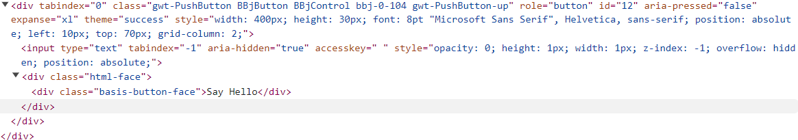
But that's deceptive because the DWC's button is a web component that contains two shadow DOMs because, as the documentation states, The dwc-button component is used to build BBjButton, BBjToolButton, and BBjMenuButton controls. When we inspect the buttons in the browser's Developer Tools and expand the shadow DOMs, we see that the actual implementation is quite a bit different:
BUI:
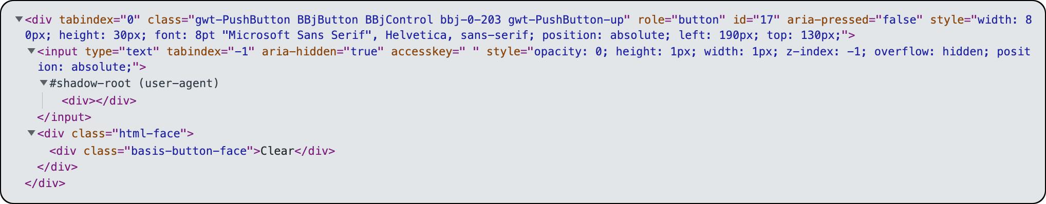
DWC:
The purpose of the shadow DOM is to ensure that web components are isolated from the regular DOM. For example, imagine you built a web component that used a class name that was already in use elsewhere on the page. If your component wasn't scoped and was affected by the global styles in effect for the rest of the page, your custom control could have its size altered radically or it could be displayed in unexpected colors. We could also run into the opposite problem, where the styles of added web components affected the rest of the content on the page by changing its size, placement, or colors. The shadow DOM effectively scopes the web component to avoid these problems, but that can cause us to run into another problem - how can we change a web component's styles if they aren't affected by any CSS outside of the shadow tree? Fortunately, there are a few different ways to accomplish this:
1) Using CSS custom properties, because a shadow tree inherits CSS custom properties from its host. Web component authors can create "style placeholders" using CSS custom properties that allow anyone to easily style or override the default style for the component. As an example of this, the DWC's BBjButton documentation has a CSS Properties table listing control-specific properties and their description. So the "--dwc-button-border-color" is a CSS custom property added by the web component author (BASIS) to allow the component's user (you, or the BBj developer) to change the appearance of the control without digging into the shadow DOM.
In the previous SetStyle.bbj program, the following code set the colors for a particular BBjButton:
rem Set the button's style via the .setStyle methodBut if we wanted to change the colors for ALL the dwc-button's instead of applying the style to a sepcific dwc-button, we could have applied the style to the WebManager with a selector:
myButton1!.setStyle("background", "purple")
myButton1!.setStyle("color", "yellow")
web! = BBjAPI().getWebManager()This sets the values for the CSS custom properties for the entire DOM, and therefore all BBjButton controls.
web!.setStyle("background", "purple", "dwc-button")
2) Using CSS shadow parts (the ::part CSS pseudo-element) that allow shadow hosts to selectively expose chosen elements from their shadow tree to the outside page for styling purposes. Like the CSS custom properties above, CSS shadow parts are another way for a web component author to expose specific pieces to the outside world. That means that we can write CSS to apply to specific elements inside a web component's shadow DOM, as we did in this example from the SetStyle.bbj program:
    myButton6!.addStyle("button-6")
    myButton4Css! =                 ".myButton4::part(control) {"
    myButton4Css! = myButton4Css! + "   background: purple;"
    myButton4Css! = myButton4Css! + "   color: yellow;"
    myButton4Css! = myButton4Css! + "}"

    web!.injectStyle(myButton4Css!)
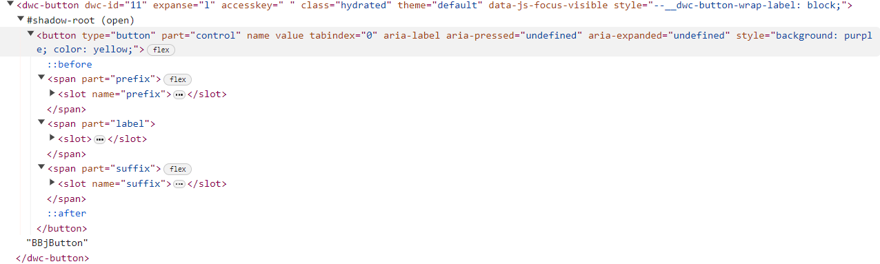
When defining the css! variable in the line of code above, we used the custom class name (myButton4) along with the ::part pseudo-element as the selector to style our BBjButton. The definition of a CSS pseudo-element says that it's a keyword added to a selector that lets you style a specific part of the selected element(s). Therefore, we matched our desired button first by providing the class name of "myButton4" that we added to the button in the first line of code. That gets us the button, but since it's a web component we need to be able to go into its shadow DOM in order to change its style. So by adding in the "::part()" CSS pseudo-element, we've now indicated that we're selecting a specific component of the button - the dwc-button's element that exposes the "control" part. Looking at the dwc-button in the browser's Developer Tools reveals all exposed "parts" after we expand the first shadow tree: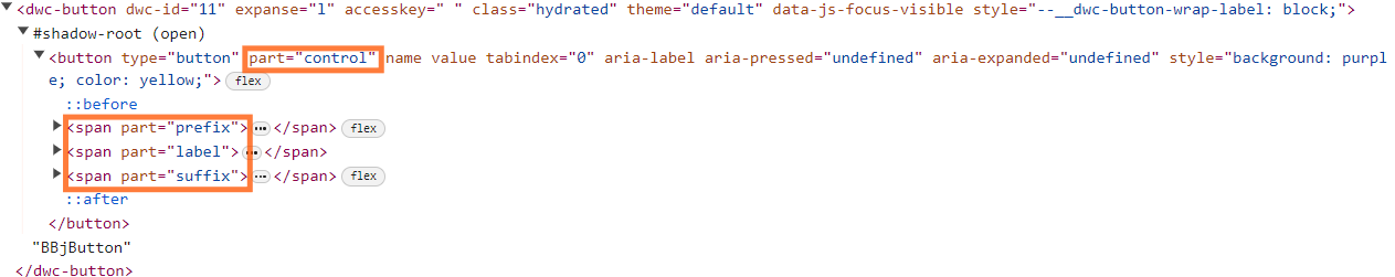
The first orange rectangle shows how the BBjButton utilizes an HTML button element and specifies the part attribute with a value of "control". So that's the element that our ".myButton4::part(control)" selector from the code excerpt above targets. The result is that we set the background and foreground colors for the BBjButton by reaching into its shadow DOM and overriding the control's default colors. We could experiment and change the selector line to this:
css! = ".myButton4::part(control) {"The code targets the "label" part of the dwc- button now instead of the "control" part, and yields a very different result:
css! = css! + " background: purple;"
css! = css! + " color: yellow;"
css! = css! + "}"
Specifying "::part(control)" in the selector:
Specifying "::part(label)" in the selector:
Now that we're familiar with the shadow DOM and how web components can expose "parts" of the control and control-specific CSS custom properties, the SetStyle.bbj program in the 02_CSSStylesAndCustomProperties folder should make much more sense to us. The code that modifies the third and fourth buttons does so via exposed CSS custom properties. And the code that modifies the fourth button does so by setting CSS styles on the control's parts:
    rem Set the button's style via the shadow DOM parts
      myButton4Css! =                 +   ".myButton4::part(control) {"
      myButton4Css! = myButton4Css!   +   "   background: purple;"
      myButton4Css! = myButton4Css!   +   "   color: yellow;"
      myButton4Css! = myButton4Css!   +   "}"

      myButton4!.addClass("myButton4")
      web!.injectStyle(myButton4Css!)
Notes:
1) Inheritable styles such as background, color, font, line height, etc. continue to inherit in shadow DOM. in other words, they are able to penetrate the shadow DOM boundary.
2) Outside styles always win over styles defined in shadow DOM.
Font Size Compatibility
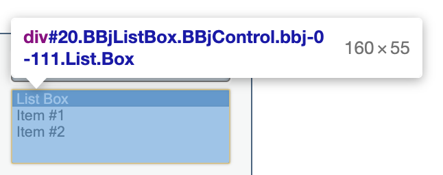
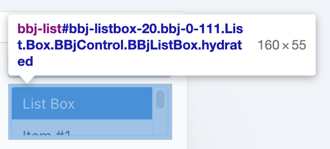
One area where the DWC differs from BUI is the default font size. When we compare the same app running in BUI and the DWC, one of the first things that you notice is that the text in BUI is much smaller than the text in the DWC. For example, compare the following BBjListBox as shown in the screenshots below:
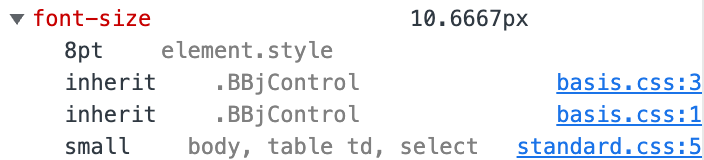
In BUI, the font size is 10.6667 pixels, and clicking on the disclosure triangle to the left of the property shows that the size is set to 8 points in the basis.css file. In contrast, the DWC's font size is determined by the value of the "--dwc-font-size" CSS custom property, which resolves to 14 pixels. An online point-to-pixel converter shows that BUI's 8-point font sizes really do convert to 10.6667 pixels, and they clear up a couple of points of confusion:
Points and pixels are not the same, but they are both fixed-sized units. A pixel is equal to one "picture element", or dot on your screen, whereas a point is equal to 1/72 of an inch. To convert between the two, one point is equivalent to 1.333(3) pixels and one pixel is equivalent to 0.75 points.
There are a couple of different ways to make a DWC app look more like a BUI app when it comes to fonts:
1) Using the LEGACY_FONTS global string variable, as in:
temp$ = STBL("!COMPAT","LEGACY_FONTS=TRUE")2) Setting the font-size CSS property, as in:
myWindow!.setStyle("font-size","8pt")
Example 3 - Font Sizes
1) If you compare the app running in BUI (with the /apps/ context in the URL) versus it running in the DWC (with the /webapp/ context in the URL), you will notice that the fonts are significantly larger in the DWC. To see the font information, in the Developer Tools click on the element selector ( or
or  , depending on the browser), then click on a BBjStaticText control in the running app. The browser will then highlight the DIV in the Elements tab that corresponds to that control. Once the control has been selected, select the Computed styles tab and scroll until you see the font-size property. In the DWC, the default font size resolves to 14px. By expanding the disclosure triangle (shown below), we can find out how the 14px size came about:
The image above shows that the control's "font-size" CSS property was set to the value of "var(--dwc-font-size)" in the "dwc-ui.css" file. The CSS file is linked, and we can view it by clicking the link.
2) Next, do the same thing with the app running in BUI. This time, the font for the BBjStaticText control is set to 10.6667 px, as defined in the basis.css file.
3) Now change your program to use the same font size in the DWC as it does while running in BUI, by either setting the global string table variable or by setting the CSS custom property as shown above. If you choose to go the route using the LEGACY_FONTS STBL, note that this will only affect fonts for controls that are added after this line is executed. Therefore, if you add it at the beginning of your program then all the fonts will be 10.6667px. But if you add the line after you have already created some of the controls, then the first set of control will be 14px in size and the remainder will be 10.6667px.