4A. DWC Controls With Extended Attributes
Overview
This section covers BBj controls implemented as web components for the Dynamic Web Client. In the process of creating the controls, BASIS has added new functionality or configuration parameters based on today's web standards and customer requests. For the time being, many of these features are available as attributes listed on the control's page in the DWC-specific documentation.Concepts Covered in This Section
- Component themes for controls
- Attributes
- The BBjTree's built-in search
- Input control labels
Component Themes
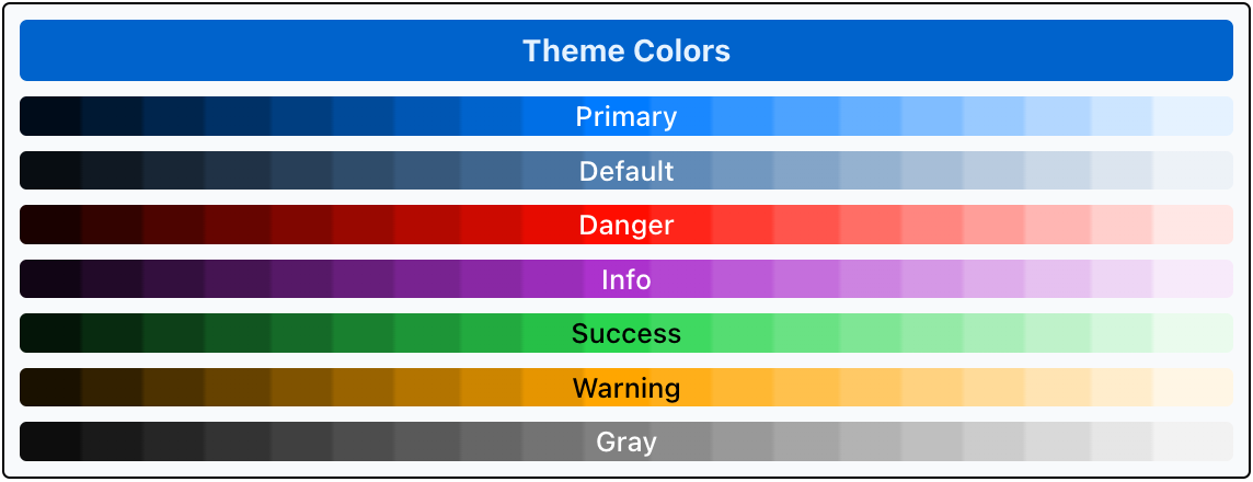
Many controls offer a "theme" attribute that can be set to one of the DWC's component themes: primary, default, danger, info, success, warning, and gray. These themes are associated with color palettes:
- primary - the main color, typically based on a brand color (defaults to blue)
- default - also known as the tone palette, which consists of gray variations tinted with the primary color and used for virtually all components (defaults to a light gray with a blue tint from the primary color)
- info - intended to be used when providing information to the end-user, and is typically a complementary color to the primary color (defaults to purple)
- success - intended to be used when denoting a successful operation (defaults to green, like a stoplight)
- warning - intended to be used when presenting a warning (defaults to yellow, like a stoplight)
- danger - intended to be used when presenting a problem (defaults to red, like a stoplight)
- gray - a palette consisting of grays (desaturated)
Here's an example from the DWC Themer showing the default theme colors by displaying gradients:
Now that we're familiar with the browser's Developer Tools, we can view the definition for the first Primary color bar:
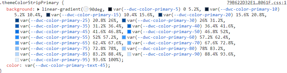
It was created by a BBjStaticText control that defined its background as a gradient using the CSS custom properties for the primary color palette. So --dwc-color-primary-25 is a very dark blue, and --dwc-color-primary-85 is a very light blue. All the color themes have colors ranging from 5% lightness up to 95% lightness predefined in this manner.
In the DWC, these colors are defined by CSS custom properties and can be modified with techniques that we've covered in the previous material. The colors typically have three properties:
- Hue, or a degree on the color wheel where 0 is red and it wraps at 360 which is also red. Example: --dwc-color-primary-h: 211; This indicates that the primary color's hue is 211º, which is blue. Changing the hue value to something like 265 changes the primary color to purple.
- Saturation - a percentage value from 0 to 100% indicating the amount of color added, where 0% is no color added and 100% is fully saturated. Example: --dwc-color-primary-s: 100%; This means that the primary color is a very bright blue, and decreasing the saturation to 50% changes it to more of a slate blue.
- Contrast threshold - the threshold from 0 to 100 where the color of text should flip from white to black for better contrast and legibility. Example: --dwc-color-primary-c: 50%; This won't typically have to be modified, but will for some colors like yellow. That's why the --dwc-color-warning-c CSS custom property is set to 35.
Most controls offer the "theme" attribute as an easy way to set the control's appearance. We saw several examples of this, including:
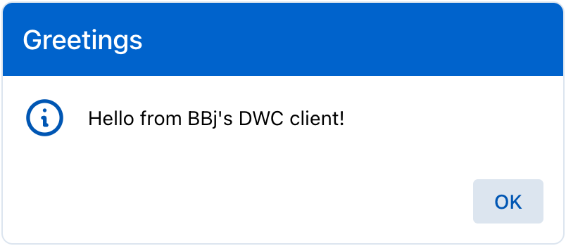
The MessageBox.bbj program, where the message box's theme was set to "primary":
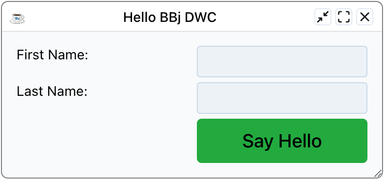
The DWC1.bbj program, where the [Say Hello] button's theme was set to "success":
Attributes
Many of the DWC controls offer attributes that provide extra functionality beyond what the control offers in the GUI and BUI clients. For example, in the screenshot above for the DWC1.bbj program we set the button's "expanse" and "theme" attributes. The expanse is a "shortcut" for affecting multiple properties at once, including the font size and the amount of padding that ultimately determine the size of the control. There are several other notable attributes for the controls, but we'll focus on the BBjTree's built-in searching mechanism which is determined by the following attributes (documentation link):
- search-input - When true then an edit box will be shown above the tree to filter items on the client-side.
- search-case-sensitive - When true, the search will be case-sensitive, otherwise it's case-insensitive.
- search-nodata - A custom message to display when there is no data resulting from performing a search.
- search-placeholder - The placeholder text for the search box.
- search-term - When set causes the tree to filter based on the provided value, meaning that you can set a BBjTree control to filter its contents programmatically. Regular expressions are supported.
Example 1 - Setting attributes on the BBjTree
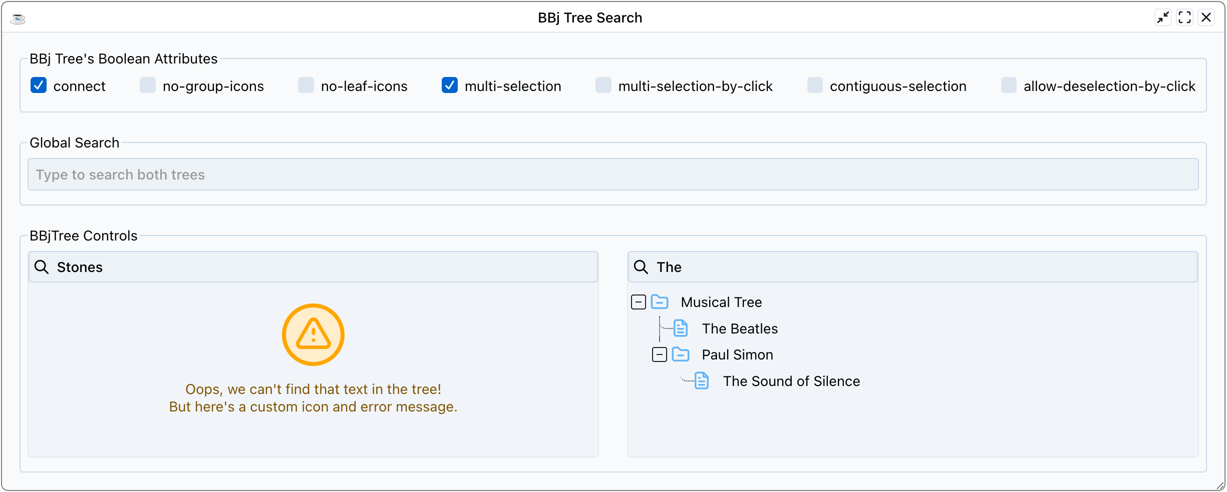
1) Start by running the DWCTraining/04_ExtendedAttributes/TreeSearch.bbj program.
2) Check and uncheck the checkboxes at the top that enable/disable the named attributes. Note that some of them, such as the contiguous-selection, are dependent on other attributes (multi-selection).
3) Search in the individual trees, then via the global search. Notice that searching for a term that doesn't exist in the trees causes the first tree to display a custom error message via the search-nodata attribute, as shown in the screenshot below.
4) As time permits, view the source code and notice all the attributes that are set, including search-input, search-placeholder, search-nodata, icon-collapsed, and icon-expanded. Also, notice how the code injected custom CSS to set the --dwc-tree-icon-fill CSS custom properties to unique values, so the first tree painted its icons in orange and the second tree painted its icons in blue.
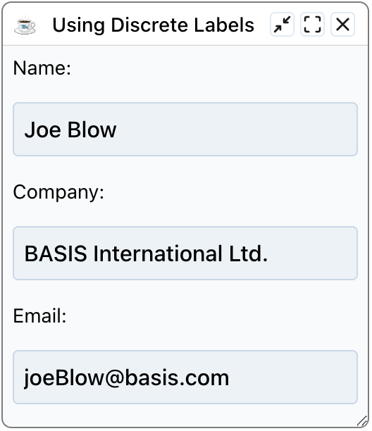
Input Control Labels
In addition to the attributes previously covered, BBJ controls that deal with input also offer a "label" attribute that creates and places a label next to the control automatically. The obvious benefit is that these labels reduce the developer’s load, as they no longer have to create, size, and place a separate text control to act as the input’s label. But there are even more benefits to these types of labels since they’re actually tied to the input control. As we'll see in a future section, the attribute labels also change color along with the input control to denote a valid/invalid state for control validation. Additionally, Narrators used for accessibility also recognize the label as being associated with the control, instead of being a separate element that's merely in close proximity to the input control. And there's one more benefit to using built-in attribute labels: since they're part of the control and not implemented using separate BBjStaticText controls, it's much easier to design responsive layouts for a window because we no longer have to group the static text and input controls together to ensure that they're on the same CSS grid row, for example.
Example 2 - Comparing attribute labels and BBjStaticText controls
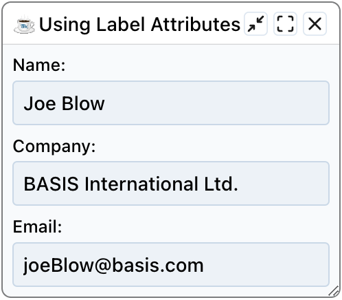
1) Start by running the DWCTraining/04_ExtendedAttributes/LabelAttributes.bbj program.
2) When the app runs, it uses a BBj message box to ask if it should use label attributes or not. Choose yes, then run it again and choose no. Was there a difference? What happens when you make the app's window very tall?
When the program uses attribute labels, the labels are actually part of the control which we can see using the browser's Developer Tools Inspector:
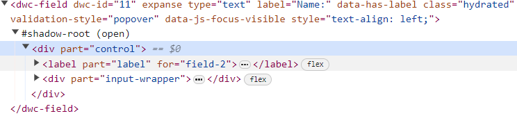
That explains why the labels stick to the input controls when we resize the form, and why accessibility Narrators know that the input control has a label.
When the program uses static text controls as labels, they're completely separate elements in the DOM:

Here is what the program looks like using attribute labels:
And here's a screenshot using BBjStaticText controls, that separate from the input controls as the window's height is increased: