5A. CSS Layout Options
Overview
This section covers the different CSS layout strategies that we can employ to make a responsive BBj application running in the Dynamic Web Client. It's important to note that many projects end up using multiple layout strategies, as some are better suited to some tasks than others. A DWC app can easily mix and match CSS layout techniques and use a combination strategies to build a responsive app that changes to adapt to the client's display in the most effective manner.Concepts Covered in This Section
- CSS layout options
- CSS flexbox
- CSS grid
CSS Layout Options
There are different ways to achieve responsive, multi-column layouts using CSS and each technique comes with its own set of pros and cons. Some are better suited for particular scenarios, and others are flexible enough to work in a variety of situations but may be more complex to develop. There are several CSS layout techniques available, but we'll be concentrating on a two of the more popular and effective strategies:
- CSS flexbox - A flexible box layout strategy that's designed for one-dimensional layout, meaning that all the content will be laid out in one direction - either a row or column. It works well for a window that contains a few controls that are to be positioned next to one another, either horizontally (flex-direction: row;) or vertically (flex-direction: column;). It's flexible because you can affect the oder of the control in the row or column, and set their flex (sizing) properties. The flex properties determine if and how the controls grow and shrink to fit the available space. So a BBjWindow that uses CSS flexbox for layout will expand the controls within to fill the available free space or shrink them to prevent them from overflowing the window's bounds. The image below shows a typical horizontal flexbox layout (flex-direction: row;), where the controls start at the left and continue to right, with differently-sized items within:

- CSS grid - A grid-based layout system built upon rows and columns that give the developer more control over the size and position of the application's elements. It's designed for a two-dimensional layout, as opposed to flexbox, so it works well for designing more complex forms. Developers can specify the grid's templates for both rows and columns, and as with flexbox, they can also define if and how controls grow and shrink to fit the available space. It's also possible to have controls span multiple rows or columns, or even locate them in specific cells leaving other grid cells empty. This can be accomplished by specifying the starting/ending rows/columns, or using named areas where developers define the grid's areas with meaning names that are used to position elements within the grid. The image below shows a more complex form that's built with a CSS grid and contains multiple rows and columns. Note that it's possible to have some items, like the large left-hand square, span multiple rows.

- Media Queries - Another technique that we'll look into to affect layout is CSS media queries. They can be thought of as an if/then conditional structure, where the @media rule includes a block of CSS properties that will only take effect if the provided conditions are true. Additionally, they also support "and", "or" and "not" boolean logic operators for very flexible conditionals. Put another way, developers commonly use CSS media queries to change the layout of their app based on the width and/or height of the screen. For example, they could employ a CSS grid layout with 6 columns for a wide screen, 4 columns for normal screen, and one column for a phone in portrait orientation. By combining CSS grid with media queries, it's easy to define different layouts for the desktop, a tablet, and a phone. Media queries can also use the devices orientation in the conditional portion, so that developers can define different layouts for portrait and landscape orientation. In addition to changing the size or number of columns, media queries can also be used to hide elements on small screens, adjust the font size to fit the screen size, or adjust content for users with accessibility needs.
CSS Flexbox
CSS flexbox is typically used when you want to lay out controls in one direction or another (row or column). CSS flexbox lets you affect the size of the controls in that dimension, as well as the spacing between controls. You may find that in some cases both CSS flexbox and grid work equally well, and in cases like that there's no right or wrong answer. But if you find yourself struggling to ensure that controls in one row of a wrapped container line up with the controls above them, then the two-dimensional CSS grid is a better choice. Listed below are some of the main features of CSS Flexbox.Wrapping
While we typically talk about a single dimension for flexbox, we're really talking about how controls are positioned in relation to one another. Therefore, adding controls in a row doesn't necessarily mean that all the controls will be a single row. That's the case when there's plenty of space in the row for all the controls, but they can conditionally wrap to another row as the available space decreases. The "flex-wrap" property can be set to "nowrap", which is the default setting for the property and means that the controls will not wrap to another row or column. Changing that property's value to "wrap" means that the controls will wrap to another row or column when the amount of space isn't large enough to fit all the controls. There's also a "wrap-reverse", in which the items will wrap onto multiple lines from the bottom to the top, or the reverse of the "wrap" value.
Direction
The "flex-direction" property determines if the items in the container are in row format (the default, and left to right in an ltr (left-to-right) system, opposite in a rtl (right-to-left) system), column format, or the reverse of those (row-reverse and column-reverse).
As is common with CSS, the "flex-flow" is shorthand and combines the "flex-direction" and "flex-flow" properties. So setting the "flex-flow" property to "row wrap" will display the items in wrapping rows.
Justification
Similar to text-align justification, the "justify-content" property determines the alignment and spacing along the main axis (horizontal for rows, vertical for columns). It's possible to justify the items to the start or end, as well as defining three different spacing models.
Alignment
Alignment is similar to justification, but it defines how the items are laid out along the cross axis (vertical for rows, horizontal for columns).
Gap
The gap controls the space between the flex items, and is used for both CSS flexbox and grid. The gap can be set as a single value (gamp: 10px;), or two separate values (gap: 10px, 20px;) for the row gap and column gap values if they're not the same.
Order
By default, the controls are laid out in the same order in which they're added to the window. But the "order" property explicitly sets the order in which an item appears in the container.
Growing and Shrinking
The "flex-grow" and "flex-shrink" properties defines how items grow or shrink in the container. Therefore, it's possible to set one control's "flex-grow" property to "1", and another's to "2" which indicates it should take up to twice as much space as the first item.
Alignment Exceptions
The "align-self" property can be set for the controls inside a window that's using CSS Flexbox, and it allows them to override their default alignment. That way, the default alignment could be set so that all the controls are at the top of the row, but you can override that for individual controls and set them to be centered or on the bottom of the window.
Example 1 - Experimenting With CSS Flexbox
1) Start by running the DWCTraining/05_CssLayouts/DWCFlexbox.bbj program in the DWC. Experiment by selecting different flexbox settings and see how it affects the boxes in the blue window at the top. Also notice how the contents of the window change size and position when you resize the window. Here's an example of what the window looks like with changed parameters: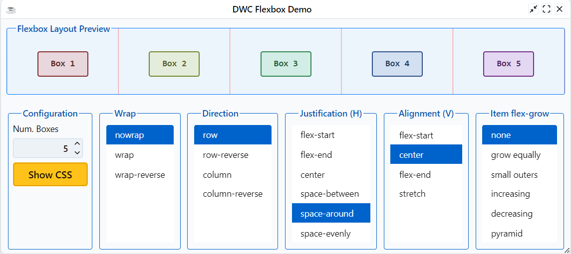
2) The information above covered the justification and alignment, and how they related to the main and cross axis. Notice that when you change from a row-based flex to a column-based flex, that the horizontal/vertical nature is flipped due to the change in axis.
CSS Grid
As covered earlier, CSS Flexbox and Grid may both be used for a number of scenarios, but some cases work better with one over the other. For example, if you're looking for a simple way to set the horizontal and vertical alignment of a control in a window, then flexbox is the easiest solution. Of course, you could use CSS Grid and specify a single-column grid or single-row grid, so it's a reasonable solution for that case as well. CSS Flexbox is more limited in the number of properties and values that it supports than the CSS Grid, so the grid model can be much more complex. The CSS Grid has 18 properties that affect its configuration, with an additional 10 properties for the controls contained within the grid. For that reason we won't be listing and defining all possible properties and values, but they are documented well with examples and drawings in the CSS-Trick's Complete Guide to Grid article.Placing Controls In a CSS Grid
There are a couple of distinct ways to use the CSS grid:1) Defining the grid and then positioning controls within the grid. It's possible to position the controls in a couple of different ways:
- Defining the starting and ending grid lines by setting CSS properties and values on the items, e.g. "grid-column: 1 / 3;" says to start the control on the first grid column line and end it on the third so that it spans two columns. Note that you can alternatively set the span, as in "grid-column: 1 / span 2;".
- Defining named areas in the grid, then setting CSS properties and values on the items to specify which area they will be placed in.
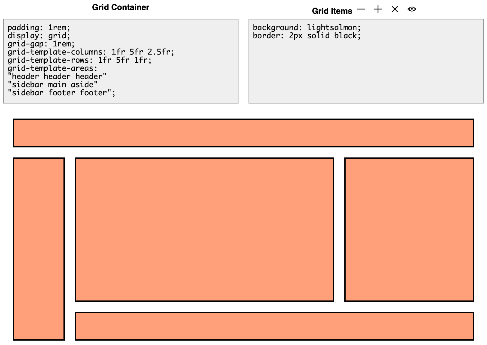
In this example, note how the bottom row is defined as "sidebar footer footer". That means that the sidebar extends into the bottom row and takes up the first column which is set to 1fr. Note that the "fr" unit is the fractional unit, which is covered in this CSS-Tricks article. In a nutshell, the fr unit is a flexible length that represents a fraction of the leftover space in the grid container. Next is the footer, but it is listed twice, meaning that it will start in the second column and extend into the third column. So its total width is the width of columns 2 and 3, plus the gap size between those columns, or 5fr + 2.5fr + 1rem, or 7.5fr + 1rem width.
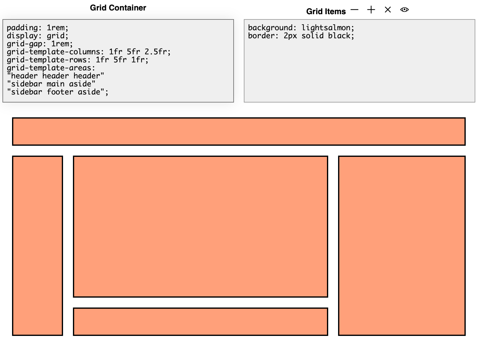
To experiment with columns a bit, we'll change the bottom row definition from "sidebar footer footer" to "sidebar footer aside". The sidebar continues to take up the first column, but now the footer only takes up the second column and the "aside" section now extends down into the third column, as shown below:
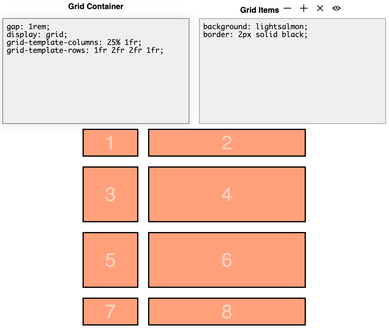
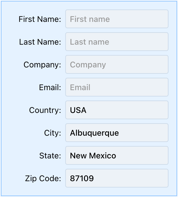
2) The second way to place controls in a grid is to define the grid's row and/or column templates. When we take this approach, the controls are added to the grid automatically so we don't have to set any styles on the items within the grid. For example, the following screenshot shows what happens when the define the grid's template rows and columns. In this case, the grid-template-columns property is set to "25% 1fr", meaning that there will be two columns with the first being 25% the available width and the second column taking up all the remaining space via the fractional unit. To learn more about the fr fractional unit, see this CSS-Tricks article. Likewise, we set the grid-template-rows property to "1fr 2fr 2fr 1fr" meaning that we've defined 4 rows. The first and last row will take up 1fr height, and the middle two rows will each be twice the height of the top/bottom row, resulting in the following grid:
For many, this is the easiest way to work with the CSS Grid, as you merely define the rows and columns and the controls will be filled in automatically. Additionally, since we're not setting the starting/ending/span for each item in the grid, this method is much more succinct.
Recall the /DWCTraining/01_GUI2BUI2DWC/DWC1.bbj program from the first chapter, where we used this methodology with the CSS grid for layout using this code:
    wnd!.setPanelStyle("display","inline-grid")
    wnd!.setPanelStyle("grid-template-columns","180px auto")
That set the window to use an inline-grid, then defined the grid's template columns to be "180px auto". Knowing what we now know about the grid, that meant that the grid will have two columns with the first being 180 pixels width, and the second column will take up the remaining space. If we just added two controls to the window, then we'd have a grid with a single row and two columns. But the more controls that we add to the grid, the more columns we end up with until we have the final form shown below: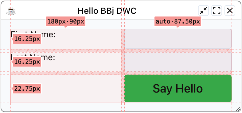
More Template Options
Now we know the basics of how to use the grid's row and column templates to define our grid, and we've seen columns defined in pixels, percentages, auto, and fr units. But there are a few more topics that will help us get the most out of grids:repeat() - represents a repeated fragment of the track list, allowing a large number of columns or rows that exhibit a recurring pattern to be written in a more compact form. For example, consider the following examples that resolve to the same definition:
grid-template-columns: auto 1fr auto 1fr;
grid-template-columns: repeat(2, auto 1fr);
In that case, we specified a "2" for the first value of the repeat function, meaning that the pattern of "auto 1fr" should be repeated twice.
But the repeat() function can also take the keyword values of auto-fit or auto-fill, meaning that the grid's tracks will repeat as many times as needed to fill the grid container.
Finally, the minmax() function defines a size range that's greater than or equal to the min value and less than or equal to the max value.
Putting it all together, we can define our grid in this way
display: grid;The first line simply set's the window's layout to use the CSS grid. The second line is where it starts getting interesting, so let's break it down:
grid-template-columns: repeat(auto-fit, minmax(10ch, 1fr) minmax(20ch, 2fr));
- We've set the grid-template-columns, but not the grid-template-rows. Therefore, we've defined the width and number of columns, but we haven't defined any rows. That means that the grid will continue adding more rows as we add more controls to the window.
- We're using the repeat() function with the auto-fit keyword for the repeat count. That means that the columns will be repeated as many times as necessary to fill the grid container, or BBjWindow.
- We've specified two columns, with the first being minmax(10ch, 1fr). That means that the grid's first column will be a minimum of 10 characters wide, and can expand to fill up 1 fractional unit.
- The second column is defined as minmax(20ch, 2fr), meaning that the grid's second column will be twice as wide as the first. It will be a minimum of 20 characters width, and can expand to fill up two fractional units.
So what does that look like in practice? It depends on the amount of space available, because when the window is narrow there will only be room for two columns. But as the window's width increases, the "auto-fit" allows more columns (in groups of two) to be added. Here are a few examples of a window defined with that grid layout at different widths:
A narrow window only has room for two columns:
But once the window adds more width, either by the user making the window larger or making their browser larger when the window is maximized, there's now room for another two columns:
And finally, making the window even wider results in another two columns added:
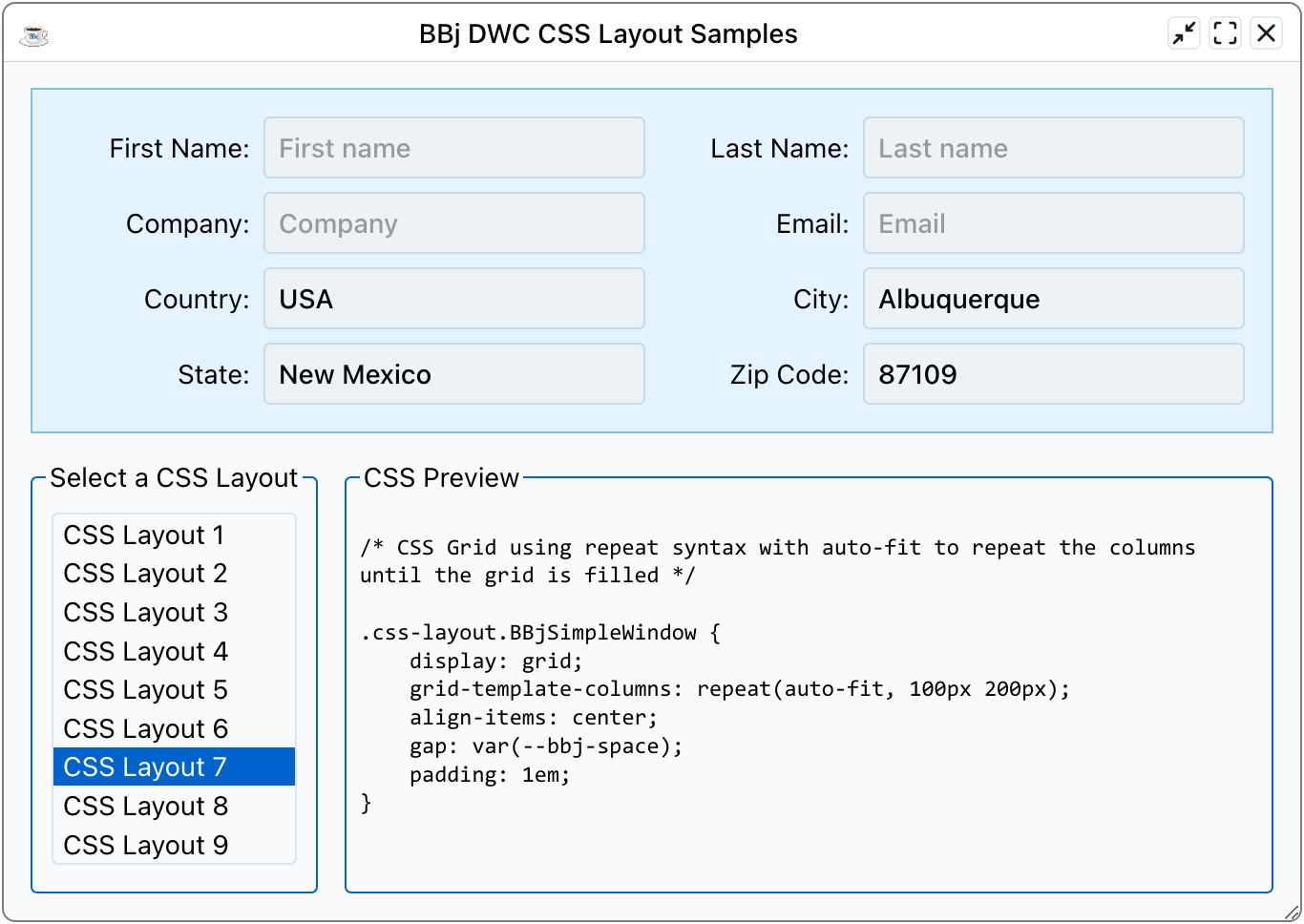
Example 2 - Experimenting With Various CSS Grid Layouts
1) Start by running the DWCTraining/05_CssLayouts/DWCGrid.bbj program, then choose different layouts from the bottom-left list box and notice how it affects the form's layout at the top.2) Note that the layouts start out simple, where layouts 1 and 2 use "auto 1fr" and "1fr auto" to show how fractional units are treated differently than the "auto" unit. When using both together, the fractional unit "wins" by grabbing most of the available space.
3) Layouts 3 and 4 both specify a two-column layout, but use percentages and fractional units.
4) Layouts 5 and 6 force four columns, which is nice when the form is wide. But since they ALWAYS use four columns, the controls are truncated when the form is narrow. Surely, there must be a better way to define more or fewer columns based on screen space, right? That's what the next layouts accomplish.
5) Layout 7 defines the grid's column template to "repeat(auto-fit, 100px 200px)", meaning that the first column (for the static text label) is 100 pixels and the edit box will be 200 pixels wide. But it uses the repeat() function with auto-fit, so now the number of columns increases based on the width of the window. When the window is narrow, the grid will have two columns (label and edit box). But as the form gets wider, more columns are added to fill the width. The screenshot below shows how the grid has four columns when the window is wide enough for two labels and two edit boxes:
 or
or ) tab. You can select different devices to emulate at the top of the browser page (and add/remove more devices in the Developer Tools configuration), but for this example choose the "Responsive" option. Once we're in Responsive mode, as shown in the screenshot below, we can resize the viewport by dragging the handles with the orange outlines. This is easier than resizing the whole browser window, especially if you're displaying the browser's Developer Tools below the page. In that case, making the browser very narrow makes it very difficult to use the Developer Tools effectively. We can also type in discrete values for the viewport size, as outlined in purple below.
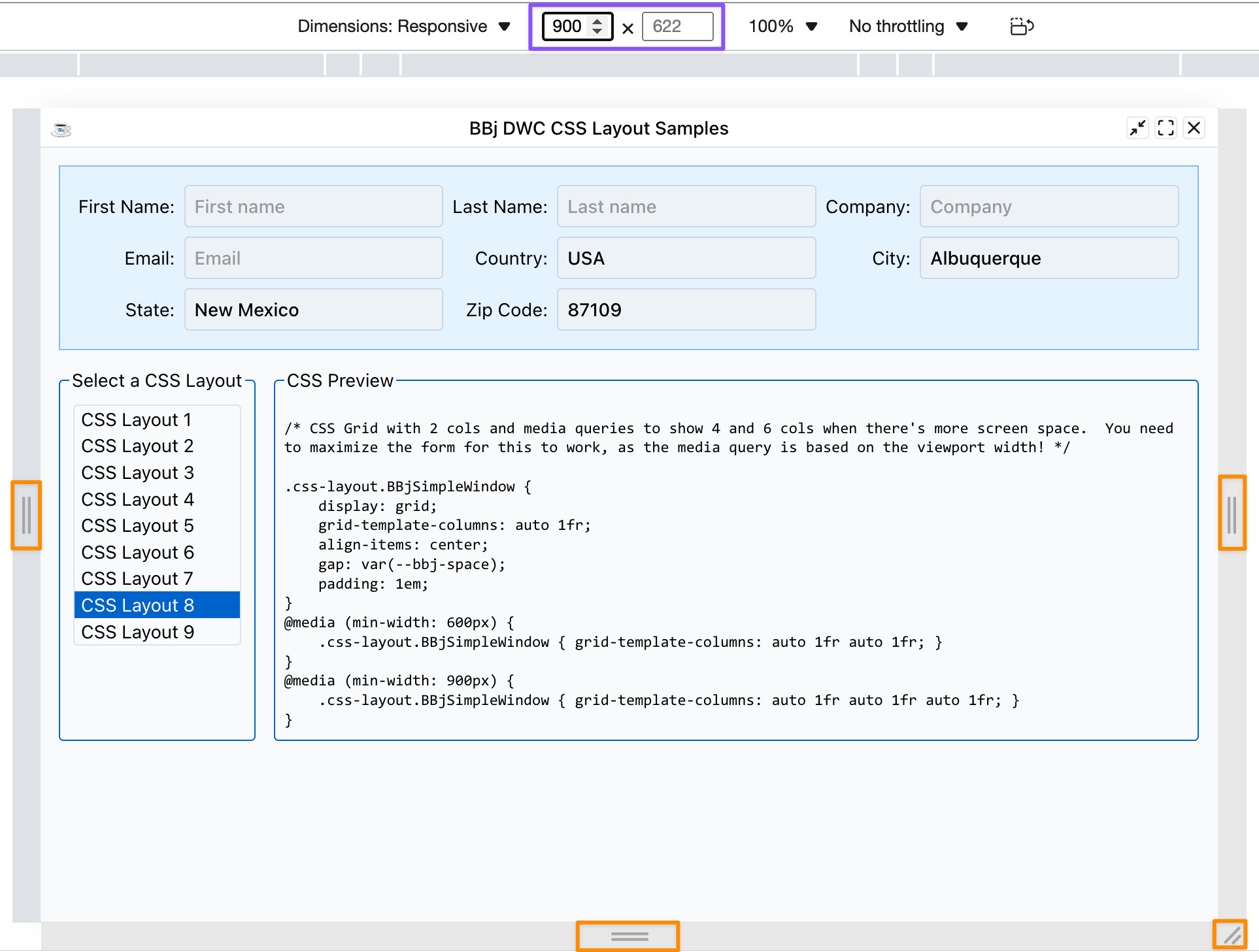
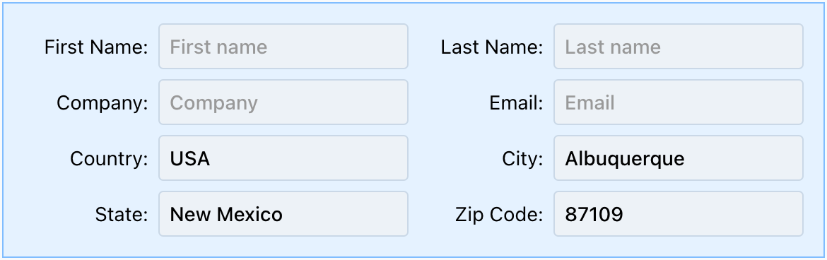
As we change the width of the viewport, the DWC app will display either 2 columns, 4 columns, or 6 columns of controls. The 4-column and 6-column versions are due to the following CSS definitions, which make use of media queries:
    @media (min-width: 600px) {
        .css-layout.BBjSimpleWindow { grid-template-columns: auto 1fr auto 1fr; }
    }
    @media (min-width: 900px) {
        .css-layout.BBjSimpleWindow { grid-template-columns: auto 1fr auto 1fr auto 1fr; }
    }
The original grid definition defines two columns, but that's followed by the CSS above. Since the CSS appears later, it has a higher specificity and so when the media query's conditional is resolves to TRUE, the provided CSS will override the window's original CSS. The first media query compares the viewport's minimum width to 600px, so when we resize the viewport to 600 pixels or wider, the window's grid-template-columns CSS property's value is then set to "auto 1fr auto 1fr", or the four-column mode. And when we resize the viewport to 900 pixels or wider, the same property is then set to a different value that defines the six-column mode. That's an example of one way to use media queries, although the 7th and 9th layout styles can achieve similar results without resorting to media queries.7) Finally, layout 9 is similar to layout 7, but instead of using fixed values (100px and 200px) for the control widths, it uses the minmax() function so that the labels and edit boxes can grow and shrink more instead of being fixed at 100/200px.
Justification and Alignment
One of the potentially tricky spots with CSS is that it allows developers to define the justification (aligns on the inline axis, or row/horizontal) and alignment (aligns along the block axis, or column/vertical). With CSS Grid, it's a little easier to deal with these two as the justification always deals with rows and the alignment always deals with columns. With flexbox, the two still apply but flip depending if you're in row mode or column mode. But justification/alignment for CSS Grid can still be tricky as we can set the justification and alignment for the items contained within (justify-items), the entire grid (justify-content), and justify-self if the grid is an item contained in another grid. That results in six properties that work in concert to control alignment.Items
The justify-items property aligns the items in the grid horizontally, and is the property that we typically deal with with working with grids. In a DWC app or in BBj terms, the "justify-items" property affects the horizontal alignment of the controls in a window that's using CSS grid layout. Likewise, "align-items" affects the vertical alignments of the controls in a window that's using CSS grid layout.
Content
The "justify-content" property affects the horizontal alignment of the entire CSS Grid in its container, but only when the grid's width is less than the width of its container. So if the grid takes up the full size of its container, the "justify-content" and "align-content" properties won't have any effect. But when the grid is smaller than its container so that it could be moved around in the container, the two properties can be set to change the grid's horizontal and vertical alignment in its container.
Self
The "justify-self" property is simply a way to override the grid's horizontal alignment when it itself is an item contained in another CSS Grid. IOW, it's only used when you nest grids and want some of the nested grids to be aligned in a non-default way compared to the rest of the parent grid's items.
Fractional Units
CSS Grids support a number of ways to define their track size (row heights, column widths) including lengths (100px), percentages (50%), or a fraction of the remaining free space using the "fr" unit. The fractional units are often used in grids, and are more flexible than fixed percentages. For example, the following two settings appear to be the same:grid-template-columns: 25% 75%;
grid-template-columns: 1fr 3fr;
After all, they're both setting the first column to a third of the size of the second column, right? That's correct, but the percentages are absolute percentages of the space, whereas the "fr" units are determined by splitting up the space that remains after accommodating other content. There are scenarios where they really do act the same, but once we start adding in a gap between the rows and columns or padding around the grid, we've dedicated some of the space to the padding and gap. Therefore, the first line that uses percentages ends up exceeding 100%. That's because now the width with the padding and gap looks like this: padding + 25% + gap + 75% + padding. Adding all those together results in a width thats greater than 100%, and the contents of the grid will exceed the width of its container. In contrast, the "fr" unit takes all remaining space and divides that up. So using the same math: width = (padding + gap + padding) + 4fr. In this case, we got the total width of the grid, subtracted the padding on both sizes, then subtracted the gap. Now we're left with the available space for the fr units, and that remaining space is divided by 4 to yield the value of 1fr. The CSS-Tricks An Introduction to the `fr` CSS unit article covers this topic more in-depth with working examples.